Introduction
The way people access the internet has changed dramatically over the past decade. Smartphones have become an essential part of everyday life, allowing users to browse websites, shop online, consume content, and interact with brands from virtually anywhere. As mobile usage continues to dominate online activity, search engines have adapted their algorithms to prioritize mobile experiences. One of the most significant changes in this evolution is mobile-first indexing.
Mobile-first indexing has transformed how websites are evaluated and ranked in search engine results. Businesses, marketers, and website owners who fail to optimize for mobile users risk losing visibility, traffic, and potential customers. Understanding how mobile-first indexing works and its impact on SEO is essential for maintaining a competitive online presence.
In this article, we will explore mobile-first indexing, why it matters, how it influences SEO rankings, and the best practices businesses can implement to ensure their websites remain search-engine friendly.
What Is Mobile-First Indexing?
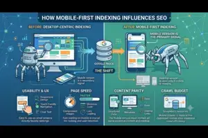
Mobile-first indexing is Google's method of primarily using the mobile version of a website for indexing and ranking purposes. Traditionally, Google evaluated the desktop version of a website to determine its relevance and ranking position. However, as mobile internet usage surpassed desktop browsing, Google shifted its focus to mobile content.
With mobile-first indexing, Google's crawlers analyze the mobile version of a website first. The content, structure, images, metadata, and overall user experience on mobile devices play a major role in determining how a website ranks in search results.
This doesn't mean that websites need separate mobile versions. Instead, Google wants websites to provide a seamless and consistent experience across all devices, with particular attention to mobile usability.
Why Did Google Introduce Mobile-First Indexing?
Google's primary goal is to provide users with the best possible search experience. Since the majority of searches now occur on mobile devices, it makes sense for Google to prioritize mobile-friendly websites.
Several factors influenced this transition:
Growth of Mobile Internet Usage
People increasingly rely on smartphones for searching information, shopping, booking services, and consuming content. Websites optimized only for desktop users no longer meet modern user expectations.
Better User Experience
Users prefer websites that load quickly, display properly on smaller screens, and are easy to navigate. Mobile-first indexing encourages businesses to prioritize usability.
Consistency Across Devices
Google aims to ensure that users receive high-quality search results regardless of whether they search on a desktop, tablet, or smartphone.
Improved Search Relevance
A mobile-first approach helps Google evaluate websites based on how real users interact with them today, leading to more accurate and relevant rankings.
How Mobile-First Indexing Works
When Google's crawler visits a website, it primarily examines the mobile version of the content. The information gathered from the mobile site is then used for indexing and ranking.
Google evaluates several aspects, including:
-
Page content
-
Headings and text structure
-
Images and videos
-
Internal links
-
Structured data
-
Metadata
-
Mobile usability
-
Site performance
If the mobile version contains less content than the desktop version, Google may miss important information that could influence rankings.
This is why maintaining content consistency across desktop and mobile versions is crucial.
The Relationship Between Mobile-First Indexing and SEO
Mobile-first indexing directly affects SEO because search engines use mobile content as the primary source for ranking decisions.
Let's examine the key ways it influences search engine optimization.
1. Mobile User Experience Becomes a Ranking Factor
User experience has become one of the most important components of SEO.
A mobile-friendly website typically offers:
-
Easy navigation
-
Readable text
-
Proper spacing between elements
-
Responsive design
-
Fast loading times
When users can easily access information on mobile devices, they are more likely to stay on the site, engage with content, and complete desired actions.
Poor mobile experiences often result in:
-
Higher bounce rates
-
Lower engagement
-
Reduced conversions
-
Lower search rankings
Google recognizes these signals and may rank user-friendly websites higher than competitors with poor mobile experiences.
2. Website Speed Has Greater Importance
Mobile users expect websites to load almost instantly. Research consistently shows that visitors abandon pages that take too long to load.
Mobile-first indexing places greater emphasis on website performance.
Slow-loading websites can negatively impact:
-
User satisfaction
-
Engagement rates
-
Conversion rates
-
Search visibility
Factors affecting mobile speed include:
-
Large image files
-
Excessive scripts
-
Poor hosting services
-
Unoptimized code
-
Too many redirects
Improving page speed not only enhances user experience but also supports stronger SEO performance.
3. Responsive Design Becomes Essential
Responsive web design allows websites to automatically adapt to different screen sizes.
Rather than maintaining separate desktop and mobile websites, responsive design ensures:
-
Consistent content
-
Simplified maintenance
-
Better user experience
-
Improved SEO performance
Google strongly recommends responsive design because it helps crawlers efficiently access and understand website content.
A responsive website eliminates many technical issues that could negatively affect rankings.
4. Content Consistency Matters More Than Ever
One of the biggest SEO mistakes businesses make is providing different content on desktop and mobile versions.
For example:
-
Missing text on mobile pages
-
Hidden content
-
Reduced navigation options
-
Incomplete product descriptions
Since Google primarily indexes the mobile version, any missing content may not be considered during ranking evaluations.
To maximize SEO performance:
-
Use the same content on all devices.
-
Ensure headings remain consistent.
-
Include important keywords on mobile pages.
-
Keep metadata identical where possible.
Consistency helps Google fully understand the value and relevance of your content.
5. Mobile Navigation Influences Search Visibility
Navigation plays a significant role in both user experience and search engine crawling.
A well-structured mobile menu helps users find information quickly while allowing search engines to discover important pages.
Best practices include:
-
Simple navigation menus
-
Clear category structures
-
Easy-to-click buttons
-
Logical internal linking
Complicated navigation can frustrate users and reduce crawl efficiency, potentially harming SEO performance.
6. Core Web Vitals Become More Significant
Google introduced Core Web Vitals to measure page experience.
These metrics evaluate:
Largest Contentful Paint (LCP)
Measures loading performance.
Interaction to Next Paint (INP)
Measures responsiveness to user interactions.
Cumulative Layout Shift (CLS)
Measures visual stability during page loading.
Strong Core Web Vitals scores indicate a positive mobile experience and can contribute to better search rankings.
Websites with poor scores may struggle to compete against faster, more stable competitors.
7. Mobile-Friendly Design Enhances User Engagement
Engagement metrics often reflect the quality of a website's mobile experience.
Users are more likely to:
-
Read content
-
Visit multiple pages
-
Watch videos
-
Complete purchases
-
Submit inquiries
When visitors engage positively with a website, search engines may interpret those signals as indicators of quality.
Better engagement often supports stronger SEO outcomes over time.
8. Structured Data Must Be Present on Mobile Pages
Structured data helps search engines understand page content.
Examples include:
-
Product information
-
Reviews
-
Events
-
FAQs
-
Business details
With mobile-first indexing, structured data should be available on both desktop and mobile versions.
Missing schema markup on mobile pages can reduce opportunities for rich search results and enhanced visibility.
9. Mobile Optimization Supports Local SEO
Many local searches happen on smartphones.
Examples include:
-
Restaurants near me
-
Digital marketing agencies nearby
-
Local service providers
-
Retail stores
Mobile-friendly websites often perform better in local search results because they provide convenient experiences for users seeking immediate information.
Local businesses can benefit significantly from:
-
Fast-loading pages
-
Click-to-call functionality
-
Mobile maps integration
-
Easy contact forms
These features improve both user experience and local SEO performance.
10. Conversion Rates Improve with Better Mobile Experiences
SEO is not only about attracting visitors; it is also about converting them into customers.
A mobile-optimized website helps users:
-
Make purchases
-
Submit forms
-
Contact businesses
-
Request quotes
-
Subscribe to newsletters
When visitors encounter friction during these processes, conversion rates decline.
Mobile-first indexing encourages businesses to create experiences that support both search visibility and business growth.
Common Mobile-First Indexing Mistakes
Many websites still face challenges adapting to mobile-first requirements.
Common mistakes include:
Hidden Content
Important information hidden on mobile devices may not contribute to rankings.
Slow Loading Speed
Heavy images and unnecessary code reduce performance.
Poor Mobile Design
Tiny text, crowded layouts, and difficult navigation frustrate users.
Missing Metadata
Titles and descriptions should be consistent across versions.
Blocked Resources
Google must be able to access CSS, JavaScript, and images to properly evaluate mobile pages.
Avoiding these issues helps maintain strong SEO performance.
Best Practices for Mobile-First SEO Success
To thrive in a mobile-first environment, businesses should focus on the following strategies:
Use Responsive Design
Ensure content adapts seamlessly across devices.
Improve Page Speed
Compress images, optimize code, and use reliable hosting.
Maintain Content Consistency
Keep important information available on both desktop and mobile versions.
Optimize User Experience
Make navigation simple and intuitive.
Test Mobile Usability Regularly
Identify and fix usability issues before they impact rankings.
Implement Structured Data
Help search engines understand your content more effectively.
Monitor Core Web Vitals
Track performance metrics and continuously improve user experience.
Prioritize Accessibility
Ensure content is easy to read and interact with on smaller screens.
The Future of Mobile-First SEO
Mobile-first indexing reflects a broader trend toward user-centric search optimization. As mobile technology continues to evolve, search engines will likely place even greater emphasis on:
-
Faster website experiences
-
AI-driven search behavior
-
Voice search optimization
-
Mobile commerce
-
Personalized search experiences
Businesses that invest in mobile optimization today will be better positioned to adapt to future algorithm changes and consumer expectations.
The focus will increasingly shift from simply being mobile-friendly to delivering exceptional mobile experiences.
Conclusion
Mobile-first indexing has fundamentally changed the SEO landscape. Google's decision to prioritize mobile versions of websites reflects the reality that most internet users now browse, shop, and search from their smartphones.
From Cubetechworld, As a result, website owners must ensure that their mobile experience is fast, responsive, user-friendly, and content-rich. Factors such as page speed, responsive design, content consistency, navigation, structured data, and Core Web Vitals all contribute to how a website performs in search results.
Businesses that embrace mobile-first principles can improve their visibility, attract more organic traffic, enhance user engagement, and increase conversions. In today's competitive digital environment, mobile optimization is no longer optional—it is a critical component of successful SEO strategy and long-term online growth.